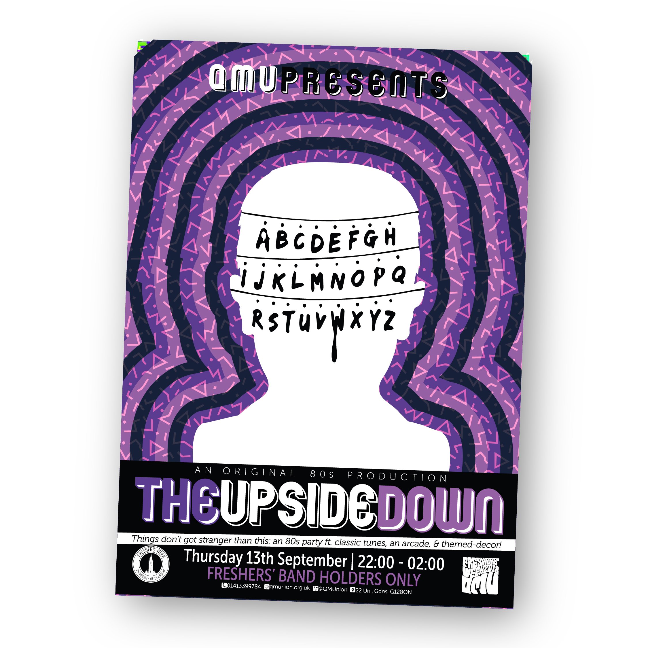
QMU Freshers’ Week - 2018
Branding, Print
Process & Development
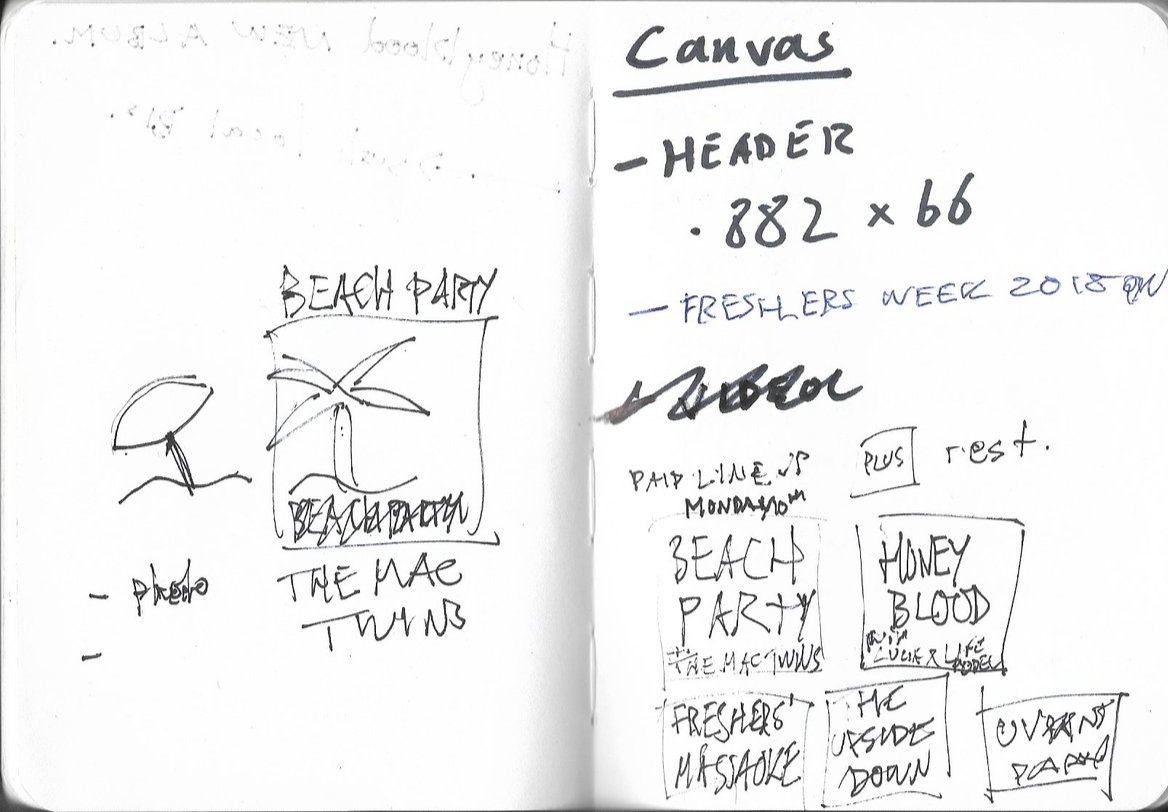
Part of my role as the Marketing & Comms Officer at the Queen Margaret Union involved designing the brand identity and assets for their annual Freshers’ Week. In 2018, I presented 3 concepts as options:
‘Brutal’ - inspired by Brutalist architecture, in keeping with the design of the QMU building, and half-tone imagery.
‘Trend’ - looking toward contemporary design trends, including bright, bold gradients paired with mono-tone photography.
‘68 ‘- inspired by the designs for the Mexico 1968 olympics by Lance Wyman, which made great use of bold, repetitive patterns.



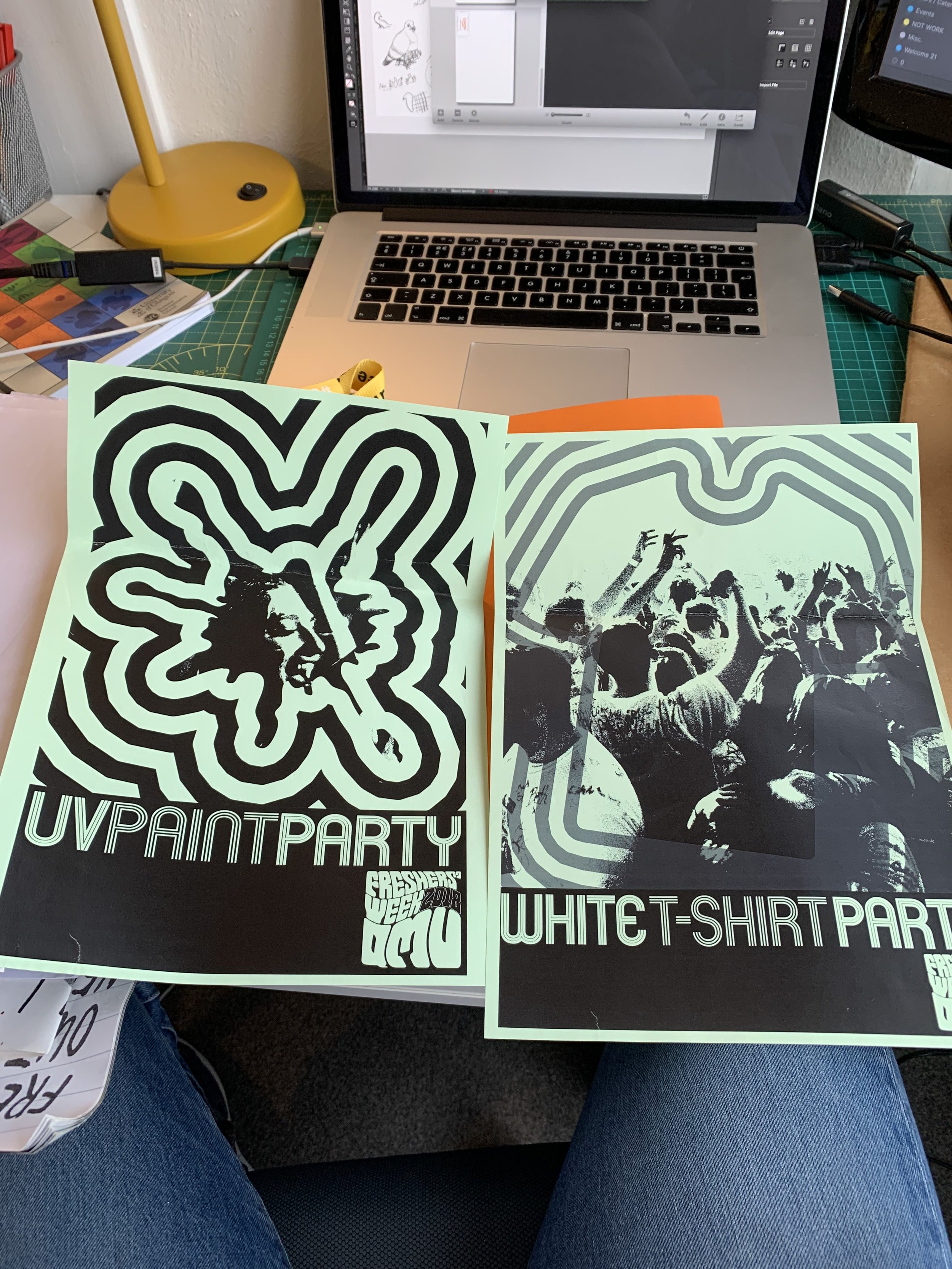
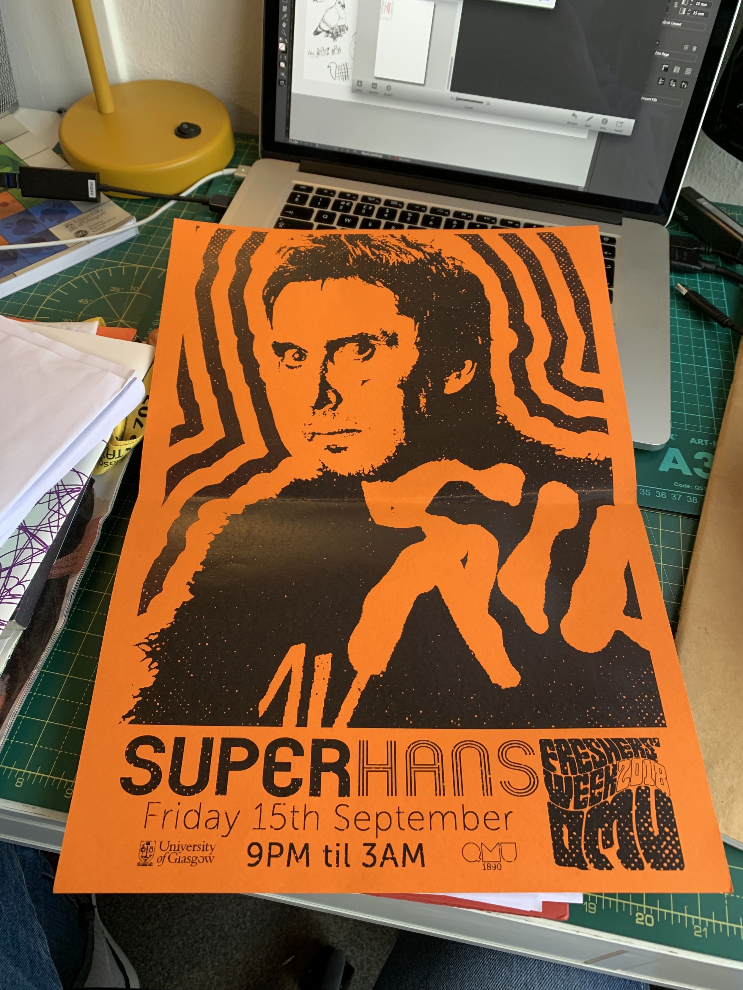
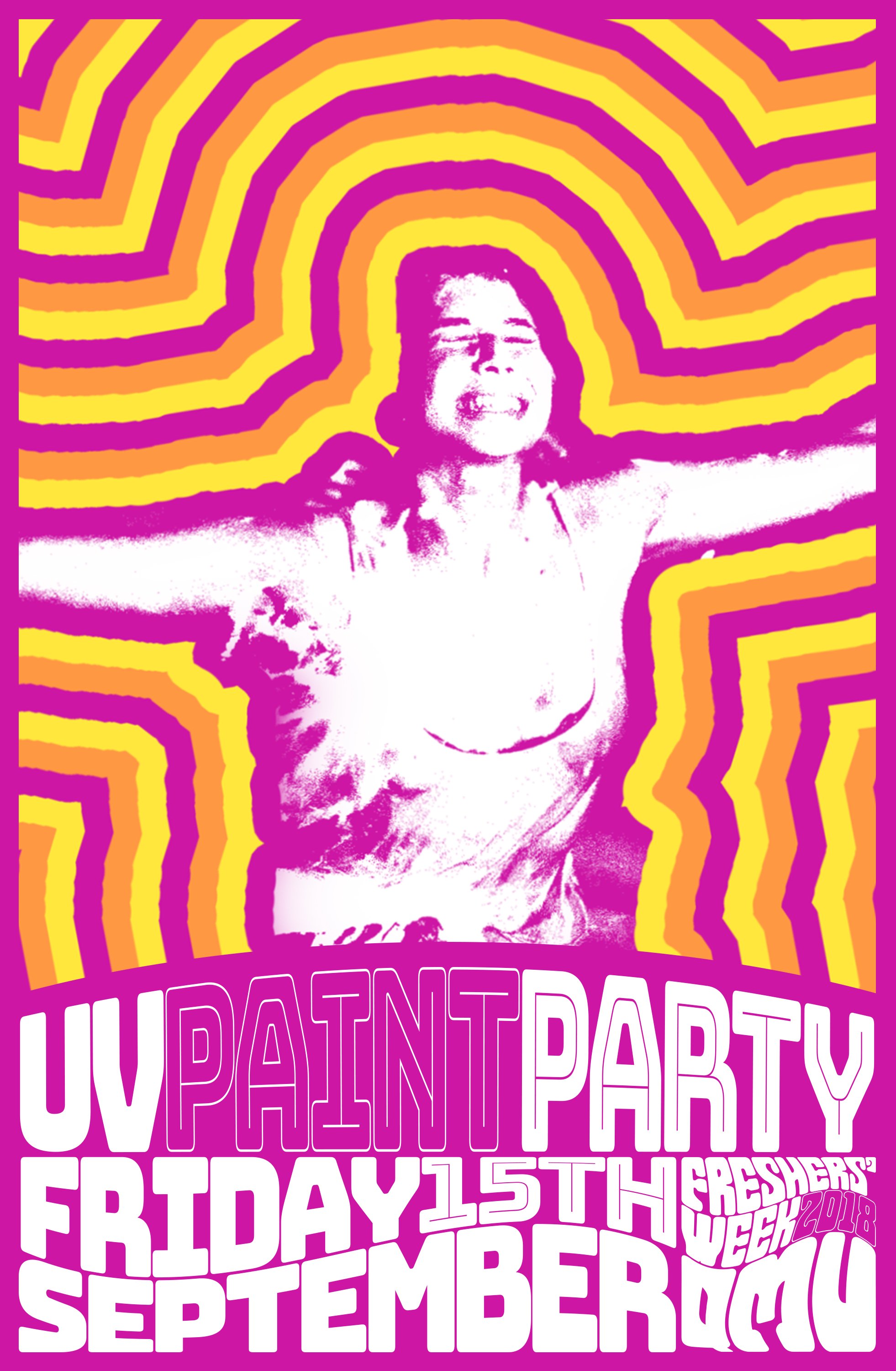
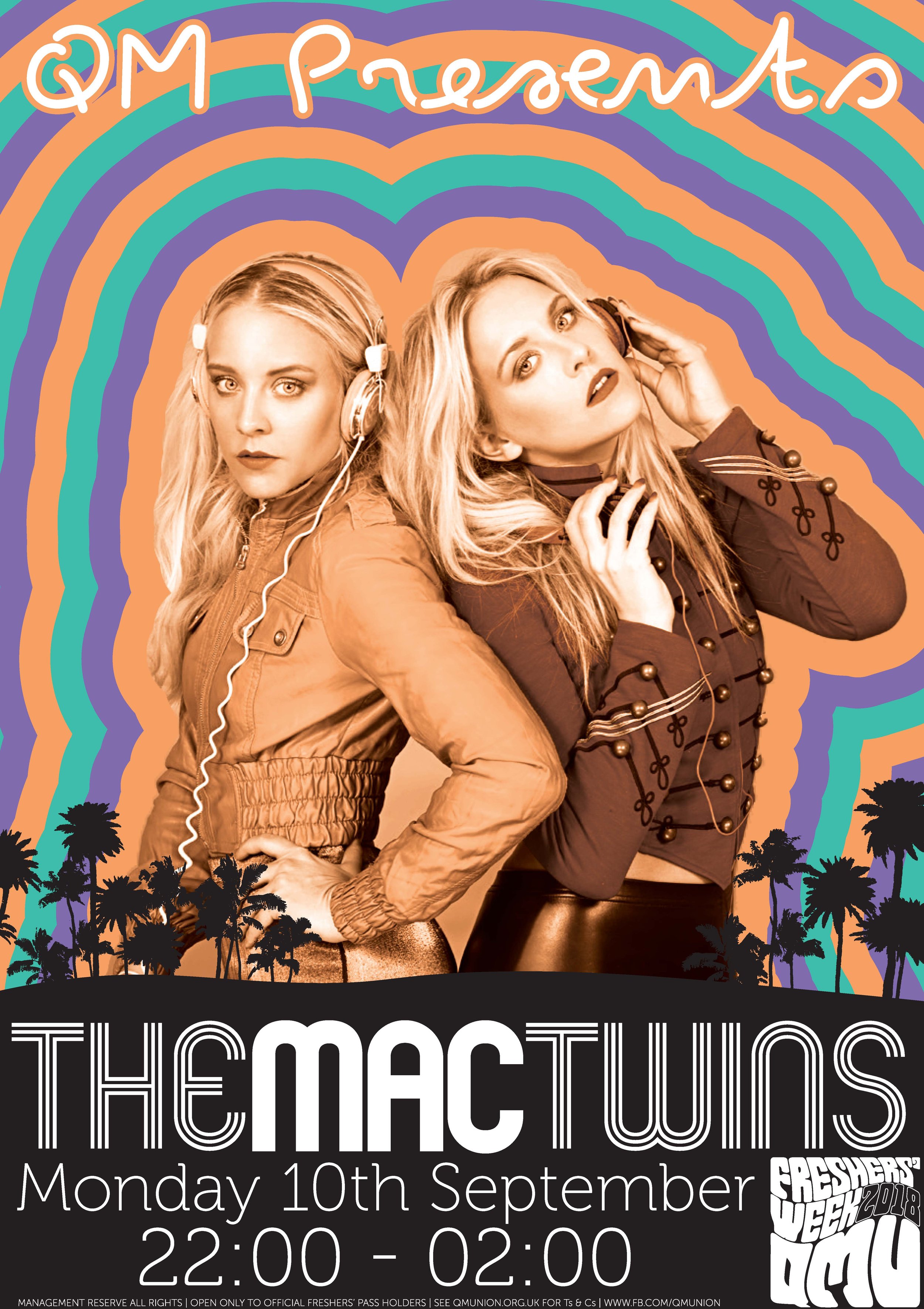

Final Delivery


